One of the arguments used by those of us who are critical of Nutriscore is that it can be «a drain» for a good number of products with a dubious relationship with health, allowing them to obtain ratings that the consumer associates with benefits (green colors and A categories ). and B). I explained the reasons for these results in this previous post and it is enough to take a critical look around the supermarket to find striking examples of good Nutriscore ratings with relative ease, as can be seen, photos included, in this post or this other one.
Certainly going «on the hunt» in the supermarket is not a very scientific method to test the rigor of a front-of-pack labeling (FOPL) system, so it is important that there are studies that systematically analyze the relationship between the Nutriscore classification and the quality of food or its relationship with health. But using complementary and independent criteria to the Nutriscore system itself, something that is not usually done, since some of the studies that are usually cited in this regard (example) have used the FSA Score to measure diet quality. That is to say, the same criteria than those used to develop the Nutriscore algorithm. And these studies usually take into account the entire diet, including fresh foods and not just processed foods. So their results cannot be considered too significant, as explained in this previous post.
To try to clarify this panorama a little, an interesting study has just been published analyzing the relationship between Nutriscore and NOVA, the food classification system based on their degree of processing (which is explained here). Although they are systems with different criteria – nutritional composition vs degree of processing – this comparison is very interesting for two reasons: First, because the Nutriscore label is only applicable to processed foods. And second, because there is increasing evidence that ultra-processed foods (NOVA level 4) are related to worse health (1,2,3,4,5).
This research, carried out by Spanish scientists and titled «Two dimensions of nutritional value: Nutri-Score and NOVA» (2021), has compared product miles data from Open food data, the database contains information necessary to classify foods using both systems. And he has obtained a few interesting results, all of them accessible in the original documentwhich is free access.
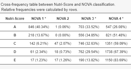
Personally, I think the most interesting result is the one that analyzes the percentage of foods from each NOVA processing level that are in each Nutriscore group, which is shown in the following table:
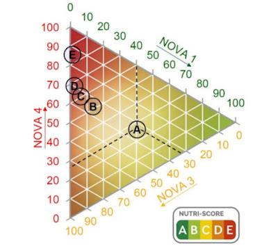
The researchers include a figure (somewhat more complex to interpret) with the same results:
And if we focus on the ultra-processed foods (NOVA 4, right column of the table) we can graphically represent the percentage in each Nutriscore group:
As can be seen, uNot out of every four products in group A (the best Nutriscore rating) are ultra-processed. And half of those classified as B (the second best Nutriscore rating) are also ultra-processed.
Based on all the results, the authors include the following paragraph at the end of their document:
«Food processing and the nutritional quality of food encompass different but complementary dimensions. All Nutri-Score categories include ultra-processed foods (…). Therefore, the information provided by Nutri-Score is incomplete and does not identify all unhealthy foods…»
It is worth pointing out that some of the defenders of Nutricore lately tend to insist that this system is not useful to know if a food is healthy or not. But I don’t think it’s necessary to explain how the average consumer will interpret a green A or B, right?


